Difference Between Table and Chart: A Comparative Guide
If you have to deal with statistics or any sort of data representation from time to time, you might be familiar with tables and charts. There is no field of study or work that does not use one of the two methods for data analysis.
Both the methods are great at helping with broad understanding, but when it comes to choosing between chart and table, which one should you choose?
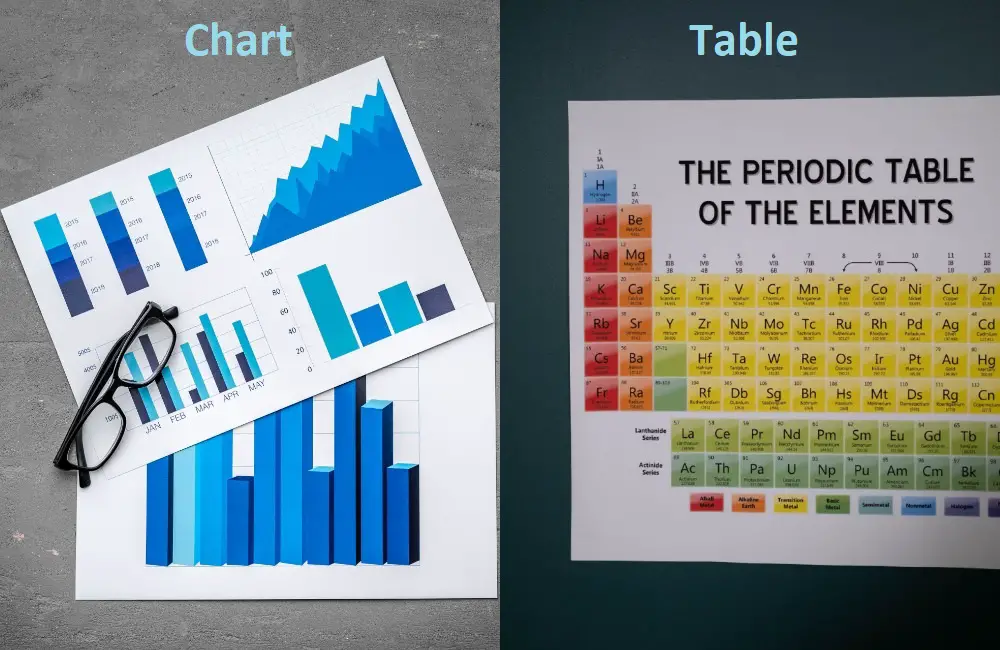
The main difference is that a table uses columns and rows, and a chart uses a sort of graph to represent any given information.
But the difference between table and chart does not end here. Some other factors play a huge role in differentiating them as well.
What Is a Table?
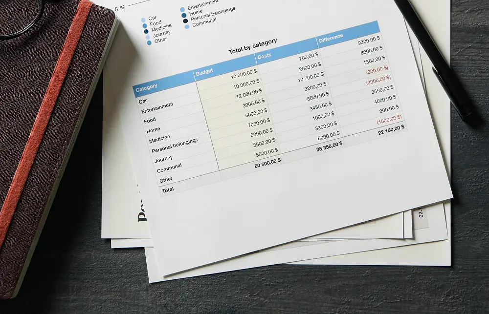
In simple words, a table is a simple display of information using columns and rows.
Rows, also known as vectors or records, usually present data about one aspect or parameter. Columns, or fields/attributes, mention the parameters. The point where a row and cell meet, or the intersection point, is called a cell. And the information you are looking for is usually displayed in these cells.
The most common uses of tables are in communication, data analysis, or research. But it is mostly used when keeping track of something. For example, how many quantities of product a factory has or units of production or attendance in a day. You could also use a table to keep track of people’s addresses or phone numbers.
As you can see, the information displayed in a table is simple and does not need explanation.
Tables are handy when you need representation that is brief and apprehensible. Any sort of detailed data can be formed into a table for easier understanding or a quick overview.
It is this uncomplicatedness that makes tables one of the most common methods of data representation. The greatest benefit that you get from a table is the huge data downscaling.
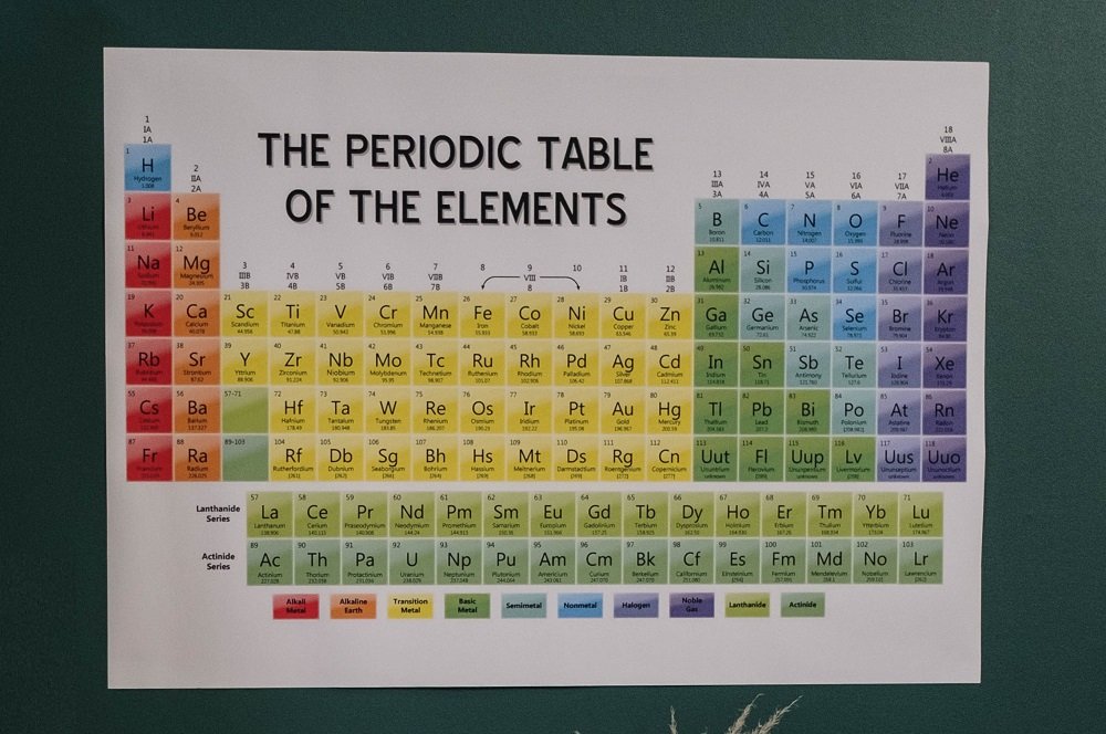
Some examples of tables that we see in our everyday lives are the period table of elements, calculation tables, or table of contents on the front pages of a book. The method helps organize, summarize and add structured data to information.
What Is a Chart?

Charts are graphical displays of data. Here any kind of information can be presented in the form of symbols. The most common kinds of symbols used in charts are slices, pie charts, bars, and lines.
With a chart, you can explain dependent and independent relationships between large amounts of data. Charts are easy to understand as they give you a more practical view of the proportions the data represents.
If you plan on using a chart, make sure the information you are expected to display does not require the addition of large texts. Large texts are seldom used in charts. The maximum amount of text that a chart requires to make its point clear is in the titles and symbol representations.
An (x) axis and (y) axis are used to showcase this graph. Parameters are described and labeled in the axis. You will also have scales that represent the weight and relationship of the information.
To present data with many variables, you use a major or minor grid of lines.
One thing that is mandatory when constructing a chart is the inclusion of a legend. The Multiple variables need to be listed here for ease of identification.
Unlike tables, charts show a deeper connection between the data presented. They do not just show numbers and straightforward data.
You can criticize and extract conclusions from a chart for better understanding and a thorough inspection.
Instead of just handing out data, charts offer a place for comparison.
Some of Our Articles You May Want to Read:
- Systematic Review and Literature Review: What’s The Differences
- Group Vs. Period: 7 Key Differences
- Difference Between Microeconomics and Macroeconomics
Chart Vs Table: The Comparison Table
Often, a decision is easier to make when you compare aspects by putting them side by side. It gives you a clearer vision and makes the decision-making process a lot easier.
While the key difference remains in the style of data representation, here are a few factors that you might like to compare side by side, in the form of a table!
|
Parameter |
Table |
Chart |
|
Basic Definition |
Tablets are forms of columns and rows used to display quick overviews of data. |
Charts represent data and their concepts in varied forms for an all-embracing understanding. |
|
Use |
Used for quick and easy overview of data. Keeps things short and simple. |
Dives into more analytical concepts of given information. Can help give users a better view of the data’s weight. Also helps explain concepts. |
|
Types |
No different types here. Just the usual columns and rows. |
Can come in the form of pie charts, surface charts, line charts, flow charts, bar charts or column chart. |
|
Symbols |
Typically, there is no usage of symbols in tables. It’s just the usual numbers and or words. |
Uses symbols in the form of slices, bars, lines, and measurable characters for analysis. |
|
Representation |
You can use quantities, names, numbers, or any other information in a row and column format. |
Units and data are presented in the form of pie charts, flow charts, bar charts, or surface charts for an explanation of data and its larger concepts. |
|
When to Use |
While comparing multiple units or measures. Also used for individual value comparisons, or to the contrast between exact and direct concepts. |
Used to compare relationships both dependent and independent. Also used for communicating any message or deeper concept that the values may hold. |
Key Takeaways
- Tables are effortless and uncomplicated presentations, while charts are graphical representations such as pie charts, bar, line, and flow charts, and hence, more profound.
- Use charts when you have a large amount of data at hand. Components of the data should have depth. Use a table when representing straightforward information such as numbers, names, quantities, and other detail that might be helpful when keeping track of something.
- If you have lots of texts to input, use tables. Charts rarely use texts. They are more symbol-based.
- Tables are simpler, while charts have lots of varieties. Use the varieties to your advantage only when you see the need to do so; otherwise, simple data can end up being unnecessarily confusing.
Final Verdict
To conclude, we would say that the difference between table and chart is mainly in the way that the data is presented. While charts use symbols, tables only use rows and columns.
Go for a table when you have simpler information to track and write down. And go for a chart if the information requires comparison and more in-depth analysis.
Now that you know their uses and benefits, you should be able to pick wisely when it comes to the battle of chart vs table.