Beige vs Cream Color: The Key Differences
One of the most significant innovations of the 21st century home décor is the creation of light colors.
Among them, the most noteworthy ones include cream and beige. Although both of them are pretty mild and envelopes areas in a soft manner, there are drastic differences between them.
From the color palette to materialistic contexts, multiple factors separate them.
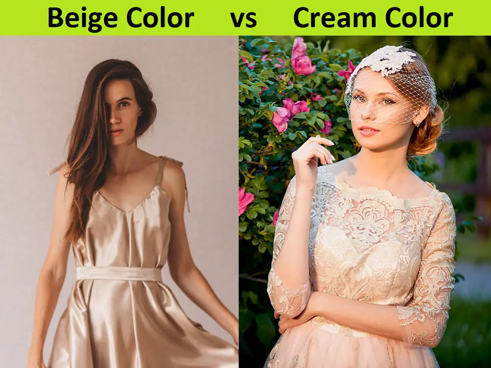
There are many approaches that we can take to separate the two shades. The best way would be the beige vs. cream approach.
It will place the two words against each so that we can explore their differences from multiple facets. Therefore, we will be able to get a clearer idea about when and how to use them effectively.
What Is Beige?
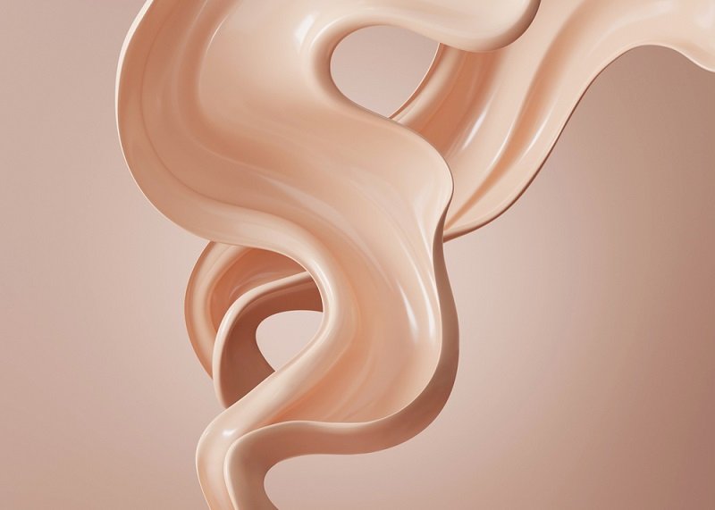
Beige is an excellent form of call that looks like sand below a warm summer sun. It comes in different shades.
All of them are incredibly soothing and sets off an inviting environment in the room they occupy.
A lot of people believe it to be a pale brown color or a mixture of brown and yellow. There are different meals that also oddly resemble it.
Beige also has an interesting effect on the mood and emotions of people and helps them feel more at ease.
It is incredibly versatile for a mild color. Furthermore, there are loads of options it can provide in terms of customization and works well with many different colors. Therefore, it is an instant favorite among many painters worldwide.
Acrylic & Oil Paint: What Are The Differences?
What Is Cream?
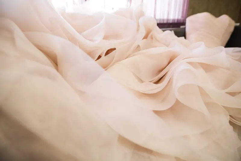
Cream is a word that is generally used to define two different items; a color type and a dairy product.
A very popular paint choice, it perfectly complements modern art styles. It has a very mellow hue and beautifully helps to make the elements in a room shine.
Also, it is a favorite pick for summertime apparel. It wonderfully compliments most fabrics and enables you to feel relaxed even during a hot summer day.
Chefs and cooks consider cream to be a staple item for making meals. In that regard, the cream is a white or yellowish liquid that is extremely rich in fat.
It is made by making milk stand for a while and letting it ferment. Many aristocrats and dessert lovers consider it to be an excellent companion when eating fruits and other delicacies. If you confuse ivory with cream color check this article of ivory vs cream color.
The Comparison Table: Beige vs Cream
We have put together a comparison table to get a more detailed understanding of beige vs. cream color and a couple of other different factors.
| Factors for Comparison | Beige | Cream |
| Color | Beige is a color that represents a calm vibe with a hint of a golden hue. It can be considered to be a mix between yellow and brown or a light brownish shade | Cream is a mellow color that can easily pair up with maximum other paint styles. Its best makeup can be similar to a combination of white and light grey |
| Texture | This paint has a very grainy and powdery feel to it. It essentially looks like a summer getaway color with the sun shining on a beach | This paint has a more elegant and smooth texture to it. It can easily be set into any room because of its characteristics. Compared to beige, it has a richer intensity |
| Food Ingredient | Beige’s shade oddly resembles that of oatmeal before it mixes with water | Cream is also a dairy product that is made from standing milk for a while. It is used in making soup and is consumed with fruit and desserts |
| Mental Stimulation | Beige has an excellent calming effect on people. As a neutral color, it is known to make people feel relaxed and at ease | Cream is considered to be an aristocratic choice in high-culture society. Upstate estates often have cream-colored walls, while it is also a standard color among premium garments |
Conclusion
It might have been difficult in the past to differentiate between modern era colors due to their contemporary use.
However, now that you have gone through our article, we are sure that you now have your doubts cleared about the beige vs. cream color debate.
Furthermore, we also feel confident that your color palette has developed considerably too. Now you will have a clearer picture of where the colors should be applied best.
