Pie Chart vs. Bar Graph: How Do They Differ?
You must have used pie charts and bar graphs for visualizing categorical data at some point in your life. But for math lovers, an age-old topic is the pie chart vs. bar graph argument.
Let us see how these two graphical representations differ.
Pie Chart vs. Bar Graph: An Overview
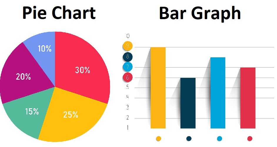
The first difference that catches a reader’s eye is the bar chart vs. pie chart appearance difference. While a pie chart is a chart that categorizes different data split into slices, bar charts plot them either vertically or horizontally.
For pie charts, you need to take the relative values of the measurements. Bar charts plot the absolute values, on the other hand. It requires no angular measurements.
Generally, bar charts are more prevalent than pie charts as they represent factual data. Even more, bar charts can use many data at once, making them more flexible.
Most people discard pie charts as they require more labeling. This does not make them very concise, which should be the primary objective of any data visualization.
However, when smaller data is used to split into fractions, a pie chart is a wiser choice.
What Is Bar Chart?
A bar chart or graph is a prevalent two-dimensional graph consisting of rectangular bars. The bars, each representing a category, have lengths that correspond to the frequency of the category.
Although bar charts can be drawn with bars standing up or lying flat (read from left to right), the vertical bar graph is the most common.
While the horizontal axis stands for categories, the vertical axis displays a value corresponding to the categories.
When looking at a large set of categories, bar charts are useful for comparisons.
For example, it is easier to see the results of the US presidential elections, each bar representing a different candidate and the height depicting the total number of votes s/he receives.
If the data is more diverse, bar charts can handle it. For example, the grouped bar charts or stacked bar charts display more complex data categories.
On the same x-axis, you could draw the data for both girls and boys having different favorite colors. The colors would represent categorical data, and the number of boys and girls can be drawn on the same bar in a grouped bar chart. You may also want to have a look at our article on difference between bar and column chart.
What Is Pie Chart?
A pie chart is a circular chart that displays percentages as a part-to-whole as though they were pie slices.
Each data category is related to a single slice. In a pie chart, the slice size corresponds with the proportion of the category compared to the whole pie.
For making a pie chart, you need a list of numeric variables and categorical variables.
For example, a fruit seller can use a pie chart to determine which fruit he sells the most in a month (the sales are numeric variables and fruits are categoric variables).
The pie chart enables him to decide which fruit he should frequently sell to draw more revenue.
The arc length of a single slice in a pie chart is directly proportional to the percentage or quantity it represents. Therefore, all the slices should sum up to have a total percentage of 100% or a total angle of 360 degrees.
When the slice proportions are very close to each other, pie charts, become complex to use. Readers cannot differentiate between the slices. They cannot be drawn to plot absolute values as bar charts can.
Main Differences between Pie Chart and Bar Graph
1. The difference in pie chart and bar graph appearance is the most prominent gap.
2. Pie charts calculate the relative values by converting them to angles. Bar charts plot the absolute values.
3. When it comes to pie charts, there is only one usage. On the other hand, bar charts have multiple usages – vertical, horizontal, multiple bars, or grouped bars.
4. Bar charts offer more flexibility due to the different usage methods they offer. Also, they can be used for both small or large data collection. As the pie charts need more labeling, they are suitable for small data categories.
5. Pie charts can take a bit longer to determine the proportions. Bar charts can be quickly drawn.
Recommended for You:
A Comparison Table to Summarize
| Parameter for Comparison | Pie Chart | Bar Graph |
| Appearance | A pie chart is a circular chart with the categories plotted as slices or pies | In bar graphs, the categories are represented as rectangular bars |
| Angular measurement | The data is converted into angles, keeping 360 degrees to be equivalent to the whole pie | There is no involvement of angular measurement in bar charts |
| Usage | Pie charts can be used in a single way – a complete circle | Bar charts can be visually represented in two ways – vertically or horizontally |
| Flexibility | Chart users consider pie charts to be less flexible as many data cannot be used. Otherwise, slices look clustered | In terms of flexibility, unless for special occasions, a bar chart should be used as it can occupy multiple categories and can be employed for different units |
| Values | The pie chart expresses relative values. It incorporates a part-to-whole comparison | Bar charts employ the absolute values |
Key Takeaways
- A pie chart is a circular graphic chart that needs to be read in a circular path. On the contrary, a bar chart has rectangular bars that need to be read vertically or horizontally.
- The measurements need to be converted into angles (the total pie adds up to 360 degrees) in a pie chart. On the other hand, bar charts label the values and variables on the x-axis and y-axis without converting them into angles.
- Bar charts are usually more preferred due to their flexibility. Pie charts make comparison difficult when similar-sized slices are drawn.
- When the set of data is small, you can use pie charts. However, if there are many categories, bar charts are preferred.
- Pie charts need more labels than bar charts to get a clear message across to readers.
- When the whole data can be divided into fractions, a pie chart is easier to use.
Final Words
That’s the end of our bar chart vs. pie chart analysis!
Now, it is vital to use the correct graphical representation. Hopefully, our article will help you with that.